BEFORE/AFTER : Warmth, Back Lighting, Grit, and Distractions
Ever since the middle of high school, I’ve been immensely interested in “the process.” You know, that middle bit between point A and point B that nobody but the artist ever sees. I’ve always loved peeking behind the scenes to see where something started and what kind of work and thought went into creating the finished product. To satisfy those of you who are just like me, here’s the second post in my before/after series which not only shows you my images straight out of camera and the final product (hover over the image to see the before), but which uses each image to explain a bit more about what I do in post. If you want to dig in way further, I cover every step of my post processing in my Editing + Consistency class. Enjoy, friends!
MONIQUE | WARMTH AND HIGHLIGHTS

5D III + 50L
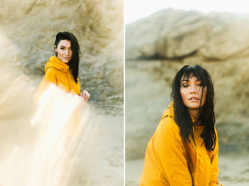
This shoot with Monique at Leo Carrillo State Beach was a freaking blast. I love the light and colors out there but what I loved most about this shoot is that I was able to test out shooting through different materials (glass, mirrors, plastic, etc). In both of these shots, I shot through a Ziploc bag partially covering my lens. On the left frame, I had hard light hitting the bag which gave it those harsher artifacts while in the right frame I had the bag in soft light for a hazier look. When you hover over these you may notice that the frame on the left was originally much darker than the right one originally was. Since I had hard light hitting the bag, if I exposed it brighter I would have lost detail in the bag and would have ended up with clear white there instead of that golden texture!
In the before/after of these the main thing you’ll probably notice is the white balance (which I’ve talked about in a previous Before/After post but I’m about to again). I always shoot on AWB because I shoot RAW and would rather not fidget with it when I can change it as much as I need to in post without losing any quality on the image. I’m all about simplicity when I’m shooting and shooting AWB allows me to keep things that much simpler on set! A combination of shooting on AWB and shooting in the shade means that my images tent to come out on the cool side. The obvious fix for that is to push the WB pretty dang far in post (which I do because warmth makes me giddy) but if you push it too far, you may notice skin tones going bonkers. In addition to bumping the WB, I also add a bit of warmth into the shadows via Split Toning in LR (If you use PS, look up Color Balance instead). This adds in warmth without taking over the skin. Yay!
Another little tip for adding more warmth into an image, lower the highlights! I know, it seems totally unrelated. If you hover over this frame and look at the top right corner, you’ll see that it blends right into the white of my website. That part of the frame is overexposed which registers as white. Even if I add all the warmth I can into an image, overexposed will still register as white. This can make frames feel disconnected. To connect the overexposed areas to the rest of the frame, I just lower the highlights by dragging down the top right point in the tone curve. Once you do that, your highlights won’t be 100% white anymore which means the warmth will register there too. Win! Lastly, I just reread all of that text and I’m sorry that I’m not a better writer. Here’s a ridiculous GIF of me to make this less dry: 
BO AND BECCA | BACK LIGHTING AND POP

5D III + 50L
WOWZA. If I had a “Top 5 Couples I’ve worked With” list, these two would be on it. Sure, they’re ridiculously good looking but aside from that, they’re both just freaking great people. Nothing can take a shoot from good to great quite like loving the people on the other side of the camera.
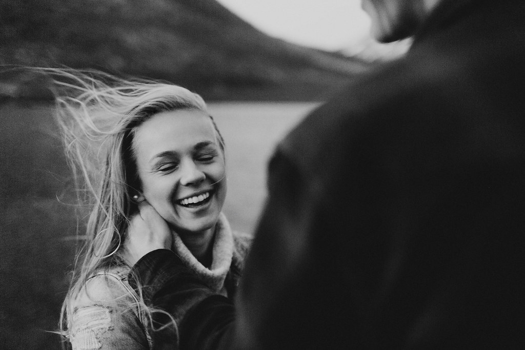
Okay, enough gushing Ben. Back to the good stuff. Since I’m able to work with other photographers so often through workshops, conferences, etc I always find it so interesting when I see patterns in what fellow photographers struggle with. On that surprised me the most when I realized it a while back is how many photographers will toss back lit images because the RAW is so washed out and flat that they don’t think they’ll be able to make anything of it. I’ve heard the frustration in statements like “No matter what I do, I can’t get it to pop like the rest of my work.” If that’s you, don’t get discouraged! Shooting back lit will give you very flat images straight out of the camera. It’s okay. No need to panic.
In the image above, you’ll see a pretty flat image transform into an image with my usual amount of pop. When shooting backlit, the more sun that is coming into your lens, the more washed out your RAW image will look. This is because light is bouncing around inside your lens and painting light into the areas of the frame that would have been rich shadows. Luckily, this is a pretty easy fix in post although it may take some playing to figure it out. The first step in the fix is contrast. If you bring it up all the way and still feel that you’re lacking the richness, this is where the other tips come in. A more general (but less controllable) fix is to try bringing up the Blacks slider. This will give some more richness into the darker areas. In some washed out images, the dark areas are still too light to register as a “Black” which means the Blacks slider won’t help at all. In this case, the Tone Curve will help you out! If you don’t understand the tone curve yet, I’d suggest reading about it before continuing on. I’ll give you a second… If you already know all about the tone curve, here’s something to keep you entertained until everyone else comes back… Okay, are you all back? Good! If the Blacks slider didn’t work out for you, try dragging down the shadows in your tone curve. If that didn’t work, start moving up towards the midtones and dragging those down until you find a spot that works. Once you do, you’ll be able to drag down that section of the tone curve until you begin to see that pop come back in. Once you get used to it, the fix takes seconds and can spare you a headache while you save some killer images!
JOEL AND ANNIKEN | GRIT

5D III + 35L
This lakeside session in the Norwegian mountains was pretty freaking spectacular. Aside from golden hour, twilight is my favorite light to shoot in. I love that soft, unassuming light that happens right after the sun drops below the horizon and before it’s gone for the night. During this shoot, thanks to geography, that soft light that usually only sticks around for about 15 minutes ended up lasting for about 2 hours as the sun moved diagonally under the horizon. I think that the more I shoot clean, bright work, the more I crave a grittier, raw look. I’ve been trying to introduce that a bit more into my portfolio and with that, comes experimentation to figure out how I can capture that gritty look without it looking too forced. You may have noticed that sometimes trying to create a “film” look in post processing can make a photo look like anything but film. Maybe the fake grain looks too digital, maybe the colors are funky, etc. Well here’s a trick I found that I really dig for adding in some texture without things looking to forced. It’s easy as heck too! I always underexpose my images just a tad (to avoid losing texture in the skin) but for images I want to be a bit grittier, I underexpose them by a couple of stops instead. When you do this and then bring them back up in post, you’ll see a subtle texture get added back into the images. Keep in mind that there’s a limit to this and that every camera handles it differently. If you under expose too much, or try this trick when shooting at an extremely high ISO, the texture that gets added in will start to look pretty digital. Test it out and find the limit so you know what you camera can handle and so you can pull out this little trick next time you need something a bit less polished!
CYRIL AND RACHEL | DISTRACTIONS

5D III + 50L
Rachel literally jumped up and down on her couch when I showed up to shoot her wedding. That’s pretty much my ideal client and I don’t mean that in a braggy “she thinks I’m awesome” kind of way. If I could always work with couples as excited about photography as I am, I’ll have made it.
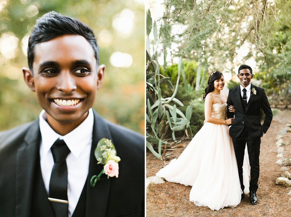
It’s not rare that I have someone describe my style as “clean.” In fact, if someone says something like “I love how ____ your work is,” there’s a pretty fat chance that blank is filled with “clean.” If you know how much of a sucker for minimalism I am, you already know how happy that makes me. Sure, I could tell you that I achieve that look through careful composition, soft editing, etc but the truth is that I’m able to foster that description by being ridiculously particular about what I leave in an image and what I take out of it. Trash on the ground? The picture doesn’t need it, it’s gone. Light switch on the wall? It’s ugly, gone. Distracting whatever? See ya. In the frame on the right, you’ll see some white specks on the ground that I took out and you’ll notice that I filled in a hole in the trees behind them. This turns complicated patterned shapes into a clean solid shapes, that your subjects can pop out of instead of getting lost in. You’ll also notice on the right side of the right frame that I took out a log in the path that overlapped with Cyril’s hip. Bold lines like that that overlap with your subjects detract from the ever-recognizable human silhouette, making them pop less. Remove the log, Cyril gets his pop back! Lastly, in the frame on the left you’ll see two tiny light artifacts that I took out of the frame on the left side of him. To me, they stood out because they were a bit harsher than the other round, softer blurs that make up the rest of the background.I know, it’s tiny and it doesn’t matter in the big scheme of the picture but to be honest, I want to care about the big scheme and the tiny stuff. It takes time but aren’t there a million and a half quotes about how nothing worth having comes easy? Thought so.
That’s all for now, I hope you found it helpful! Feel free to dig in to my other free education in my blog or check out my Self Paced Classes. Until next time, high-fives!
AS ALWAYS THIS IS VERY INFORMATIVE, lot to study. I appreciate you posting informative/advanced information, not just how a certain tool works, but how to use that tool for specific results.
While research a bit more on the tone curve I wound up asking myself “is this the same as a curves adjustment layer?” If not how do they differ? Thanks.
Jared, yep! Same tool. I do all of my editing in LR so it’s the tone curve. If you do it in Photoshop it would likely be a tone curve adjustment layer.
Great Article ben! Always nice to get some insight into your workflow!
AMAZING as always. And so APPRECIATED, ben! A hearty thank you to yoU. Cheers!
Beautiful!
I like a lot your way to show these cases. Usually sooc shot might look a bit boring or meanless, but we all should think like you had opened the post processing in this post. Do not judge yourself or the raw images. They might have pure magic after correct adjustments.
Thanks BEN!
THERE is absolutely nothing wrong with your writing! I could sit here all day and read and absorb and giggle at your funny little links. these are always some of my favourite posts of yours, thank you for sharing, for the honesty and the smiles 🙂
LOVE your blog posts, ben! I can’t wait to take your classes some day soon. quick question, do you remove distractions in LR or PS? & what tool is your favorite for removing distractions?
Thanks Taylor! It really just depends on what it is. If it’s quick and easy I’ll do it in LR with the Spot Removal Tool (set to heal), if it’s a tougher job, I’ll do it in PS with the clone stamp or the healing brush.
you sir, are a genius! thank you so much for sharing
Hi Ben, i was looking at your mobile images and was wondering what preset/filter you used for those? I love the colours.
Thanks Jen! For my mobile images I edit with VSCOcam. I tweak them a lot but mostly use M5.
Love how much you share with all of us. You have seriously helped me become a better photographer! Your removal of distractions is very inspiring but looks pretty daunting. It makes me think a lot more of what is in my frame when I am shooting because I am not very talented in taking things away in post. Do you have any suggestions on how to successfully take away distractions in PS?
Thanks so much, Sabrina! It does take time but it’s worth it for the style I love. I typically do it with the spot removal tool in LR (if it’s an easy job) or with the clone stamp and healing brush in PS if it’s more in depth.
Love the before and afters so much!! Thanks so much for all the tips…not dry at all 😉
Thank you so much Ben for sharing! This was great.:)
Thank you ben for all those information. Your work inspires me a lot aNd it is great to know that your photographs doesn’T come perfEcT sooc lol 🙂
Thank you, i admire your style
Thank you so much for this! You are so helpful. What tools did you use to remove the unwanted details in the last photo? Did you use lightroom? I always try to remove things like that (like signs in road shots) but I struggle removing things that are touching objects that I want to keep (like the log in your photo). How do you do that?
Hey Abbi! I use the clone stamp and healing brush in PS. It can take a while to get good at it but if you practice, you’ll learn how it works a bit better and you’ll get quicker and quicker with it!
Your work inspires me a lot aNd it is great to know that your photographs doesn’T come perfEcT sooc lol
This was so super inFOrmative! Thanks so much for always making great stuff 🙂
I’ve followed you on facebook for a while now, and finally ventured to your website. I love it! Particularly the gifs mid sentence, those are my favourite.
Please come to Australia and mentor me!
Beautiful editing as always. Thank you for sharing and much love to you!
thanks for sharing Ben!! Always learn a lot from your articles:) Thanks for the tips and insights into your own workflow!
Loved this! bookmarked for sure. Thank you.
One question – when you remove objects in post like on the last 2 pictures that’s done in photoshop right? i wanted to check because in an above comment you said you do al your editing in LR.
thanks ben!
oops! I just saw that you had answered that QUESTION – sorry! apparently i hadn’t finished scrolling..
I am a blogger and I really want to up my photography game. Your tips are so clearly written and easy to understand, even for someone with VERY minimal training. Thank you for this info!
I will be coming back to this post again and again! Always love your posts, thanks ben! 🙂
Thank you so much for this! Your posts are always very precious.
Second time reading through this – I can’t get enough, you are amazing! Question – on photos like Bo and Beccas, what do you do to soften their skin? It looks so soft and pefect without being cheesy edited.
Thanks Madeline! There are a couple of retouching techniques I use, one is just a basic spot removal tool in LR, healing brush in PS, or a technique called frequency separation. Shooting in soft light is super helpful for minimizing the retouching work because soft light is so flattering for skin texture!
This is amazing@ Thank you so much for sharing it with us.. LOVE seeing before and afters.. makes me fall in love with photography again!
oh my goodness – so beautiful and extremely helpful. i’m currently saving up to buy one of your self paced classes! love your work.
Thank you very much Ben!
Thanks for sharing, Ben. I loved all 3 of the before/after posts!
you never use a flash?
Valentina, pretty much never. The only time I do is during the dancing at weddings!
thanks mate, very useful tips!
This is SO GREAT. Thank you, Ben, for being so damn dry and explaining this madness in common sense words for us all. Huge help.
great stuff, love to come back he for inspiration!
I LOVE THAT YOU WRITE HOW YOU WOULD BE TALKING. When written to formally my mind wanders off.
Thank you for sharing. Feeling really stuck at the moment so I love your energy and open words of wisdom. Is there some where on your blog I can read about ‘ frequency separation’? Not heard that before. Your photos have soul.
Thank you so much!
I don’t have any articles on Frequency Separation but there are some great tutorials on youtube for it!
I always enjoy reading your blogs and looking at your work, you really are awsome! not only your stunning work but that you actually put in so much time for others, you are one of a kind Ben Sasso…
Great article and beautiful pics!
Can you tell me which of your preset you used? Specifically for Monique and Bo and Becca? Really lovely and it suits my style. I’ve been thinking about purchasing one of your presets but not sure which will work for me.
Gracias!
Amelia
Thanks Amelia! I didn’t us any for those. If you take my Editing Class, it covers exactly how I edit that style.
I always shoot way too warm, so I am definitely going to try AWB for my next few sessions to see if there is a change. rather than adjusting WB all day during a session 😛